In September, we asked you to give us your thoughts on TWSE in our first-ever reader survey. What you told us was valuable. For the past three years, we’ve been taking an educated guess at what our readers were looking for. That’s often resulted in changes that necessarily weren’t the best option.
That’s no longer the case. Our fourth redesign, aka “TWSE 4.0,” is a reflection of user feedback, as well as an attempt to provide a consistent experience across any device — something that wasn’t always the case with previous redesigns. On average, nearly half of our traffic comes from mobile devices, and our design often didn’t work as well on smaller screens as it did on a desktop screen.
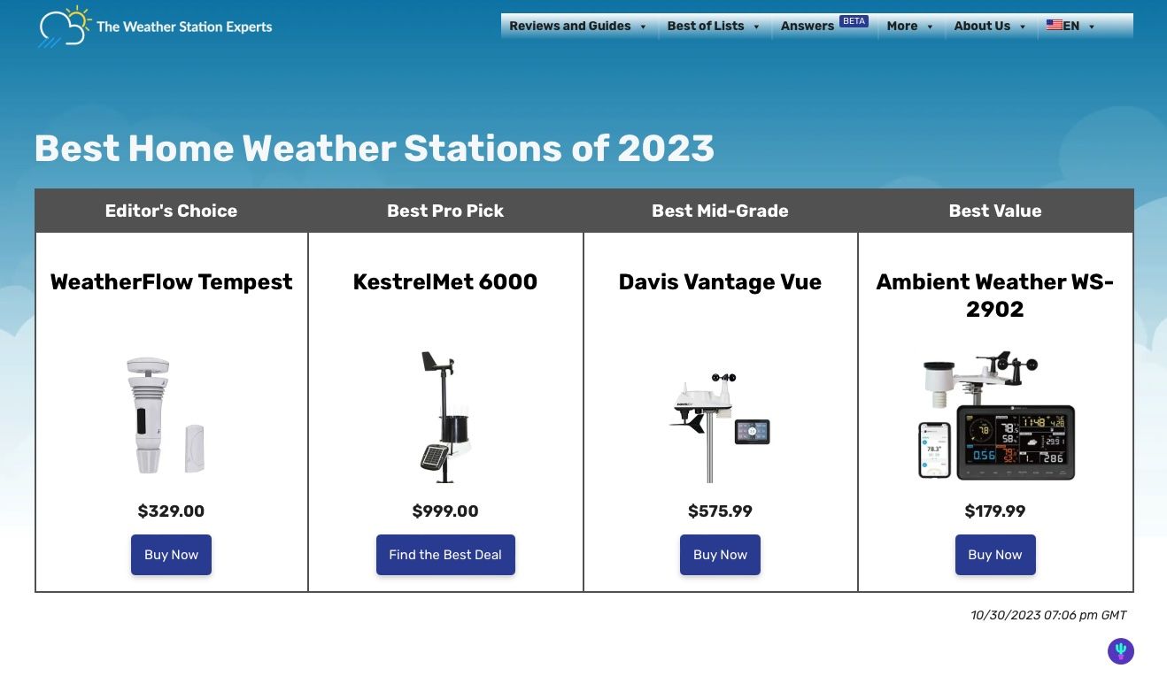
With TWSE 4.0, you’ll notice that the site looks very similar across any device you use. It also makes better use of available space on each device, which ensures that you have to scroll, swipe, and tap less. We’ve also leveraged our large content library to bring more relevant content to you without you having to look for it where appropriate, and have focused heavily on community.
Better Organization
Our roundup pages start with our recommendations at the top, followed by more extensive reviews below, with a menu that lets you quickly skip between them. You’ll notice the sidebar is gone, and instead only appears where necessary. For example, if you scroll to the bottom of the redesigned front page, you’ll see places where we’ve used a sidebar to highlight additional relevant content.
Sidebars are useful, but they sometimes are a waste of screen space too. In this design, we’ve tried to make it a useful part of the design rather than a place where we throw stuff that we didn’t have space for elsewhere.
Our new review pages push the highlights of our reviews to the top (scores, pros and cons, etc), with blog posts also featuring a similar redesign. A new sidebar feature called The TL/DR; (Too Long Didn’t Read in Netspeak) allows you to quickly move to different points in the post. On a desktop, this is all now in the “first screen” you see, and mobile users will notice that they’ll scroll a whole lot less than before, too.
On our old site, you would have to scroll about a quarter down the page to get all that information, so that’s a significant improvement. We’ll again use the sidebar to highlight relevant content (notice a theme?) that you might be interested in.
We hope that you’ll find these recommendations much more relevant than before: previously if you visited a top 10 list all you would see are other top 10 lists. With over 150 pages of content now, this left out 95% of our content, hiding other potentially relevant blog posts.
We also spent nearly a week cleaning up our tags and categories. This is the first major reorganization of site content since we started in 2021, so there were things we just weren’t using anymore. Now with everything categorized and tagged properly, search results should also improve.
We also have added additional links throughout the site where relevant which link to categories and tags where you can explore our archives.
With the launch of the new site including about a dozen new pieces of content, we figured it was a good time to ensure as much of our content is easy to find as possible.
A Better Menu
We introduced the “mega menu” two years ago as we expanded beyond simply weather stations. As opposed to your standard dropdown menu, mega menus can fit a lot of links. But we truthfully didn’t make use of it.
Our desire to keep the experience the same across all devices led us to reconsider how we organized our menus. Menus are now more logically organized, for example, all our reviews and guides are now in a single menu.
A Fast, Modern Design
The website is also far smaller: on average, page sizes are at least 25% smaller than they were before. On a mobile device, this makes a considerable difference in loading speed. A lot of this was old code being loaded when it didn’t have to.
But our favorite part is the design itself. Our logo includes a cloud, so we’ve taken that concept and used it throughout the design. We’ve tweaked our “Sky Blue” motif to match and used CSS magic to make the background seemingly fade into the page content. Clouds don’t have hard edges, so we’ve also applied that throughout the design.
Another big change is our font. With the savings in page size, it allowed us to expand beyond your standard web fonts. Rubik is far more readable, and its wider character size matches well with the round edges everywhere else.
Our search has returned to the menu (why did it ever leave?), along with the language switcher. I bet you didn’t know that TWSE is now available in seven languages!
These changes are in response to a fair bit of constructive criticism of the site helping to narrow down reader’s choices but not make a decision, and that we focused a bit too much on the reviews when you all wanted to read more than just that. You simply had to do too much work in the previous design, and that’s our fault.
Introducing Answers, Ratings, and Better Commenting Features
Finally, TWSE 4.0 introduces new community features including Answers, a community help forum, and a brand new commenting system.
We’re really interested in hearing what our readers think (and know!). You’ll be able to rate articles (which let’s us know how we’re doing), and follow commenting live — especially useful for breaking weather news articles, which will return this winter (also a common request from the survey!).
Answers is a Quora-like forum where you can both ask and answer weather-related questions from the community. While we recommend you reach out to your manufacturer’s customer support team, in some cases, asking here could help somebody else with the same problem.
You’ll also notice throughout the site at the bottom of some pages links to relevant questions on Answers, in addition to commenting. While more of you are reading TWSE than ever, our comment sections haven’t seen the same increase in activity. Hopefully, these improvements make it easier for you to participate.
Answers is being released in Beta through the end of 2023, as we’re curious to see how it is used. Since the holiday season is our busiest time of year, it gives us a much bigger readership to test things out.
What Do You Think?
We want to hear what you think of the new design. Leave your comments below. And if you spot any issues, we want to hear about them, too. We’ve gone over things quite a few times, but sometimes little bugs slip through the cracks.
Thanks as always for your support. We hope we did well this time.
Ed and Team TWSE


